OVERVIEW
quash is an independent online magazine centered around world affairs and street culture. The site often references music, art, and design with a strong emphasis on curated aesthetics and current trends.
OVERVIEW
quash is an independent online magazine centered around world affairs and street culture. The site often references music, art, and design with a strong emphasis on curated aesthetics and current trends.


YEAR
2025
ROLE
Graphic Designer
SERVICES
Logo Design
Color Palette
The fluid sound of the brand name and its smooth, rounded letterforms inspired to reinforce these qualities in the logo design.
The Time Burner typeface was chosen for its circular design, which perfectly complements and emphasizes the round letters in the brand name.

Top terminals were added to 'q' and 'a' for better readability, echoing the bottom serif and enhancing visual harmony.
The ink bleed effect adds softness and cohesion to the letters, enhancing the smooth, fluid feel of the brand name.
Bolder version was chosen for stronger impact and added a subtle outline to improve readability and enhance bold positioning.
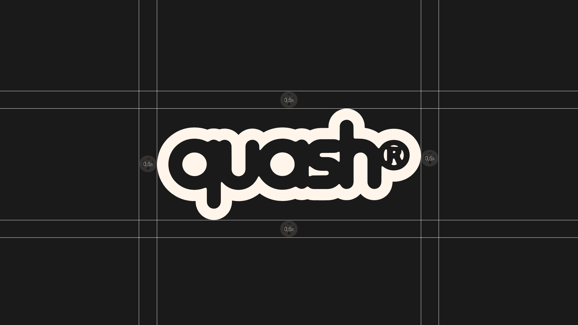
The safe zone is set at 0.5x the size of the ® symbol, ensuring the logo stays clear and impactful by maintaining space from

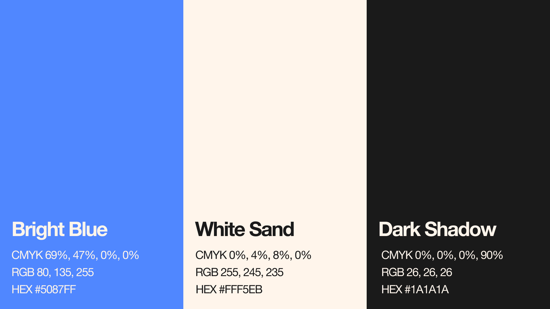
The logo uses the client’s original brand blue. Additionally, a custom neutral palette was created with White Sand and Dark Shadow – soft white and black tones chosen specifically to give a gentle feel. These colors add versatility across backgrounds.

With the slogan “World Affairs”, and a request for an icon, several logo options were created using different graphic styles while keeping a consistent overall look.


The final logo successfully reflects the smooth, fluid character of the brand while remaining clean, recognizable, and versatile across digital and physical applications.


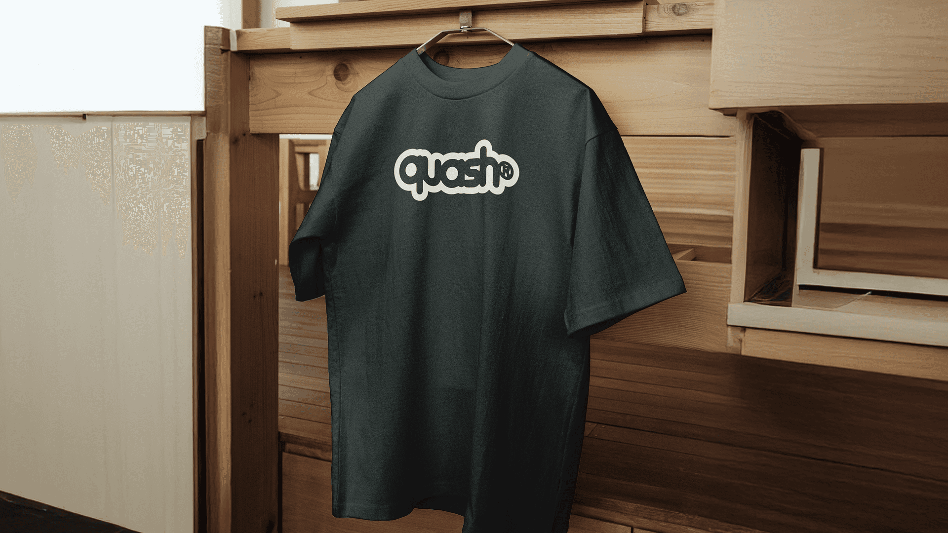
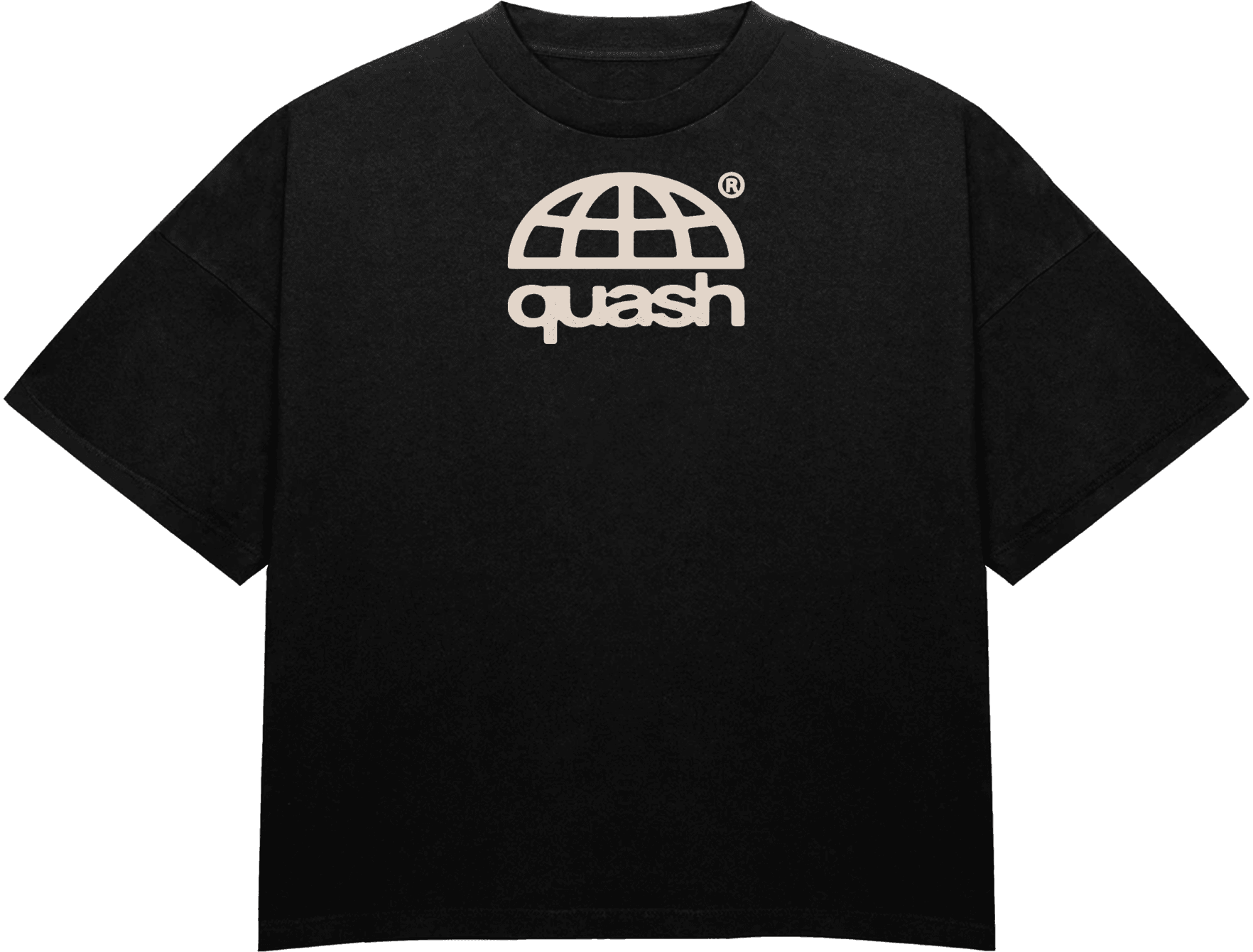
The task was to create a logo that is clean, recognizable, and clearly visible, especially when seen on clothing and
user-generated content viewed on
mobile devices.
OVERVIEW
quash is an independent online magazine centered around world affairs and street culture. The site often references music, art, and design with a strong emphasis on curated aesthetics and current trends.
YEAR
2025
ROLE
Graphic Designer
DOMAIN
Editoral
SERVICES
Logo Design
Color Palette
The task was to create a logo that is clean, recognizable, and clearly visible, especially when seen on clothing and
user-generated content viewed on
mobile devices.
The fluid sound of the brand name and its smooth, rounded letterforms inspired to reinforce these qualities in the logo design.
The Time Burner typeface was chosen for its circular design, which perfectly complements and emphasizes the round letters in the brand name.
Top terminals were added to 'q' and 'a' for better readability, echoing the bottom serif and enhancing visual harmony.
The ink bleed effect adds softness and cohesion to the letters, enhancing the smooth, fluid feel of the brand name.
Bolder version was chosen for stronger impact and added a subtle outline to improve readability and enhance bold positioning.
The safe zone is set at 0.5x the size of the ® symbol, ensuring the logo stays clear and impactful by maintaining space from
The logo uses the client’s original brand blue. Additionally, a custom neutral palette was created with White Sand and Dark Shadow – soft white and black tones chosen specifically to give a gentle feel. These colors add versatility across backgrounds.
With the slogan “World Affairs”, and a request for an icon, several logo options were created using different graphic styles while keeping a consistent overall look.
The final logo successfully reflects the smooth, fluid character of the brand while remaining clean, recognizable, and versatile across digital and physical applications.