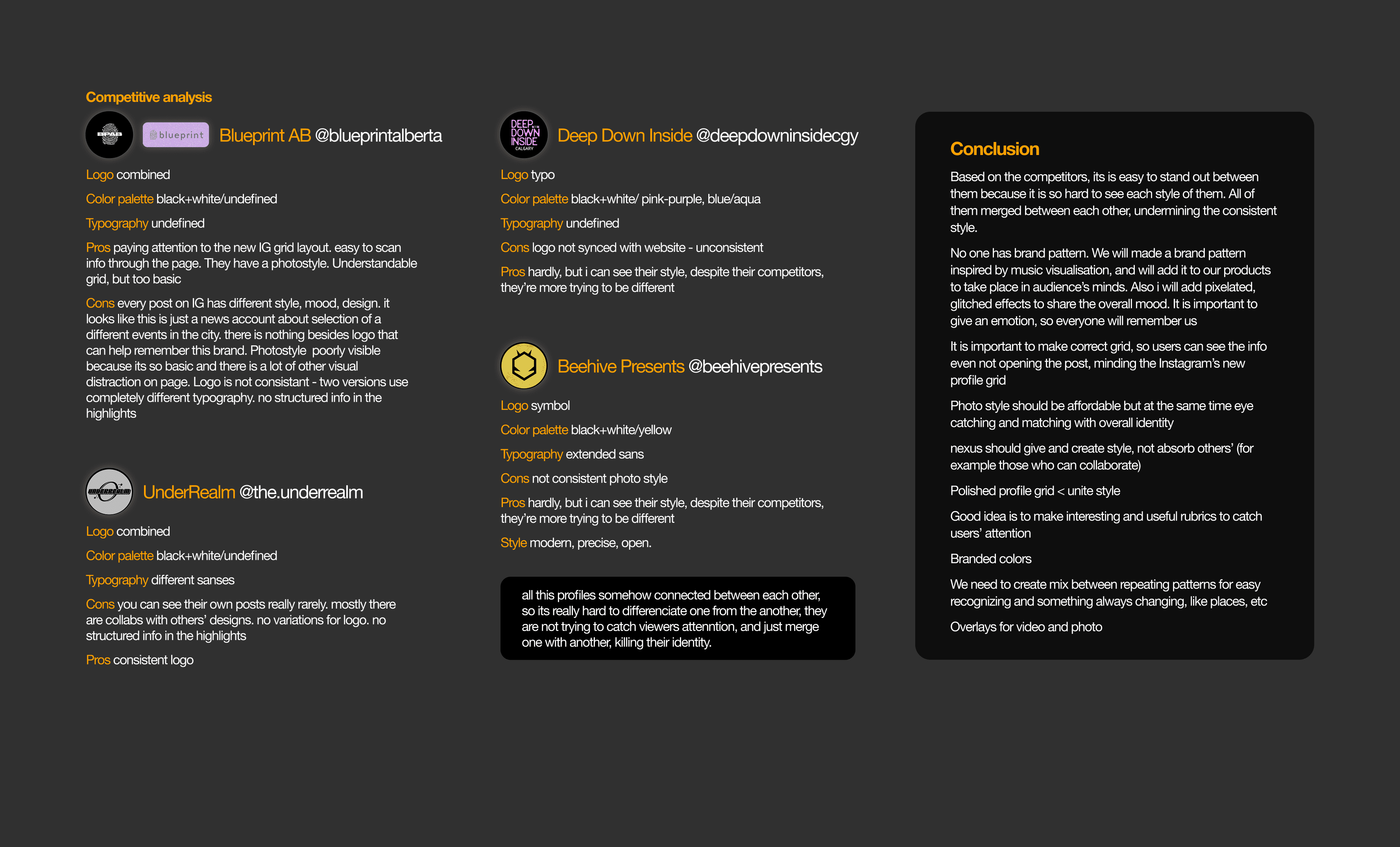
Nexus Vibes

OVERVIEW

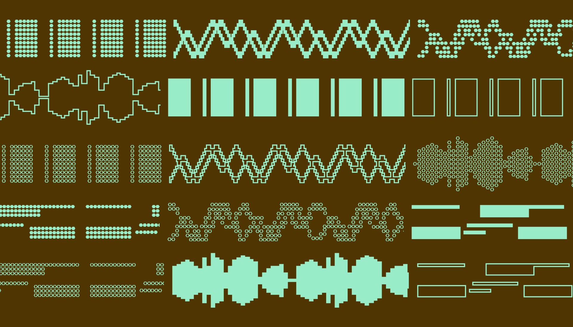
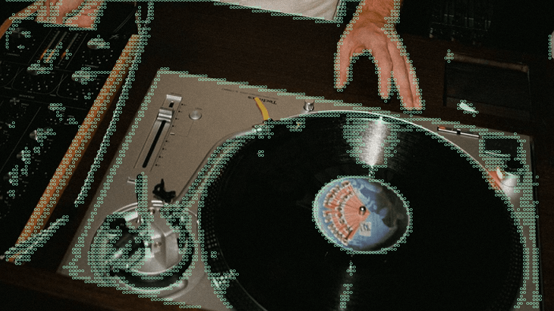
Nexus Vibes is a series of electronic music events built around one idea: the deep interconnectedness of music, people, and atmosphere. Each event takes place in a unique location and is brought to life through striking visual aesthetics.

Image of 3 pixelated flat icons
A laptop with a h32 word on it.

YEAR

2025

ROLE

Brand Designer

Art Director

SERVICES

Brand Identity

Brand Guidelines

Creative Direction

THE BRIEF

The challenge was clear after competitive analysis: most event brands in the space visually merge into one another. Inconsistent logos, borrowed aesthetics, no recognisable system. The goal was to build an identity strong enough to stand on its own, across every touchpoint.

Image of multiple pixelated flat icons
The word "H23" pixelated

THE CONCEPT

Three brand archetypes shaped every decision: the Magician's exclusivity and sense of transformation, the Rebel's unconventional approach, and the Creator's attention to immersive detail.

The brand's existing hexagon became the central symbol: a geometric form that represents connection, dividing the stage from the crowd. The visual system blends precise geometry with organic, pixelated noise: structure and chaos, just like electronic music.

LOGO

The primary logo pairs a hexagon-based symbol with Nimbus Sans: minimal, structured, and instantly recognisable. The symbol is built on strict proportion: all side lengths equal, spacing between strokes matching stroke width. A system of balance and repetition that mirrors the brand's core values.

Three logo variations cover every application: symbol + wordmark and symbol only.

TYPOGRAPHY

Two typefaces, two roles.

Nimbus Sans L: clarity, structure, long-form content
Xe Dogma: pixelated, bold, used for creative accents and headlines

Together they create tension between precision and experimentation — the same tension that defines the events themselves.

COLORS

Pure black and soft white form the foundation: bold, immersive, grounded in underground aesthetics. Four accent colors extend the system: Indigo, Pulse Red, Future Green, Bright Orange. Each tied to a brand archetype, each carrying its own emotional weight.

The color combination system is built on complementary contrast, tonal contrast, and light complementary pairs, giving the identity flexibility across posters, digital, and print without losing coherence.

PATTERN

A mix of film and digital photography: spontaneous, real-life captures over polished production. Vibrant color meets minimalist framing. The approach creates an unfiltered visual narrative that feels like being there: the energy of the event, the mystery of the space, the people mid-experience.

PHOTO STYLE

A mix of film and digital photography: spontaneous, real-life captures over polished production. Vibrant color meets minimalist framing. The approach creates an unfiltered visual narrative that feels like being there: the energy of the event, the mystery of the space, the people mid-experience.

SYSTEM IN USE

The identity extends across every touchpoint: social media, large-format street posters, tabloid and letter flyers, stickers with QR codes and brand phrases, and business cards designed as an experience in themselves. Each application follows the same logic: bold, precise, slightly cryptic.

The Nexus Vibes identity gives the brand a clear, ownable visual language in a market where most competitors have none. Every element reinforces the same idea: an experience worth showing up for.

The system is built to scale: from a phone screen to a building facade, from a sticker found on a lamppost to a brand guidelines document.

Create a free website with Framer, the website builder loved by startups, designers and agencies.