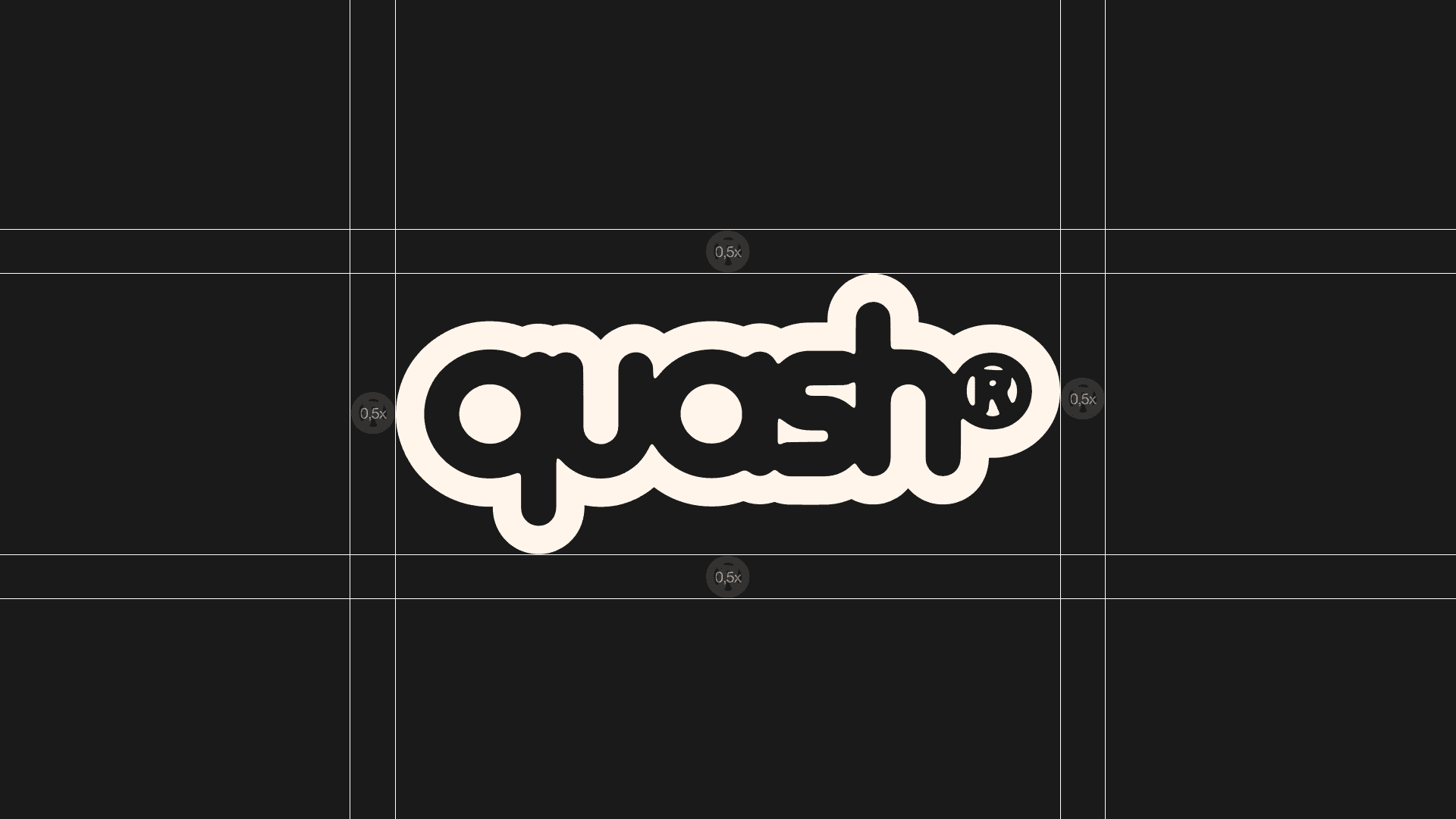
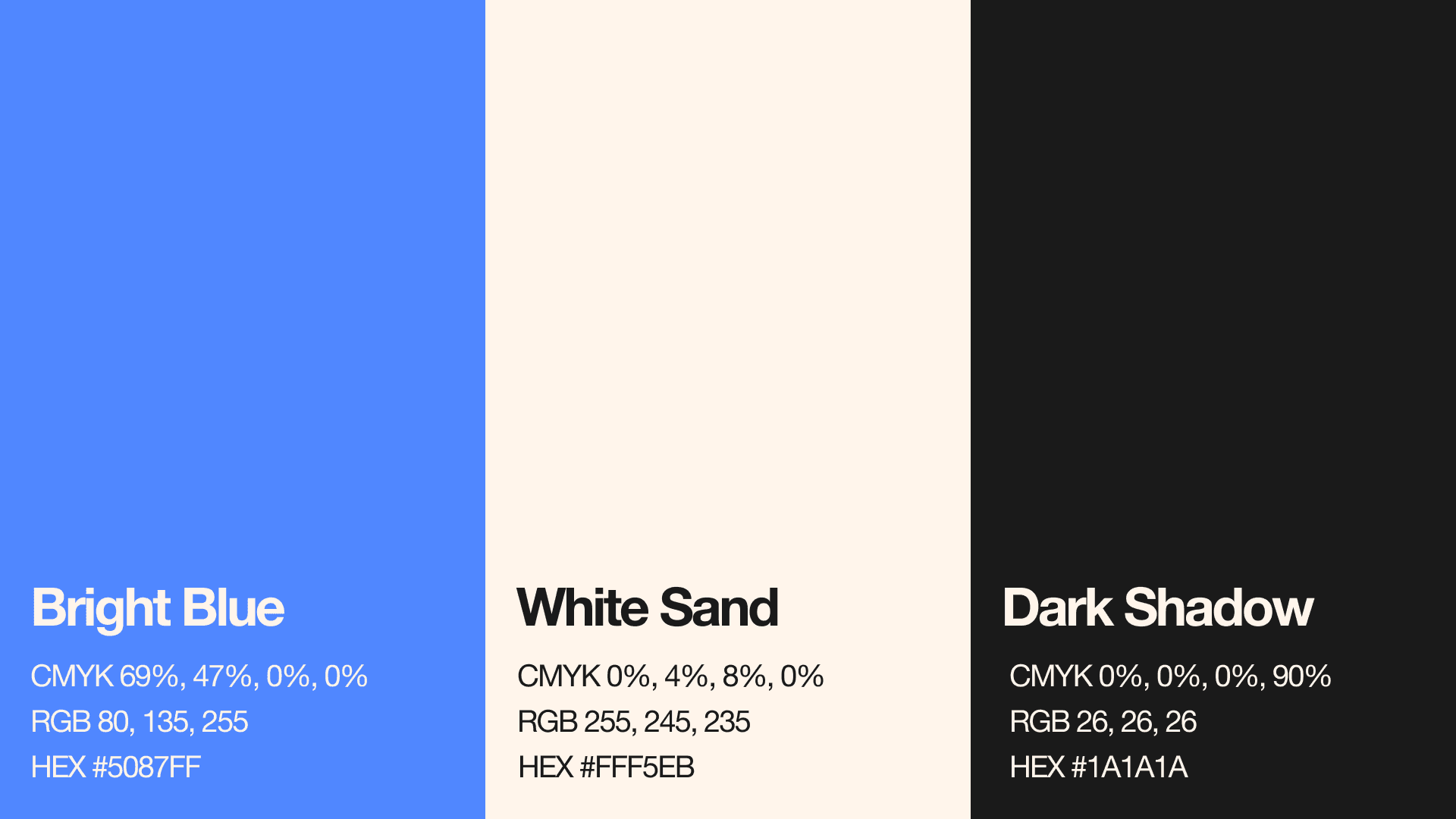
quash

Eryndale Museum of Art

OVERVIEW

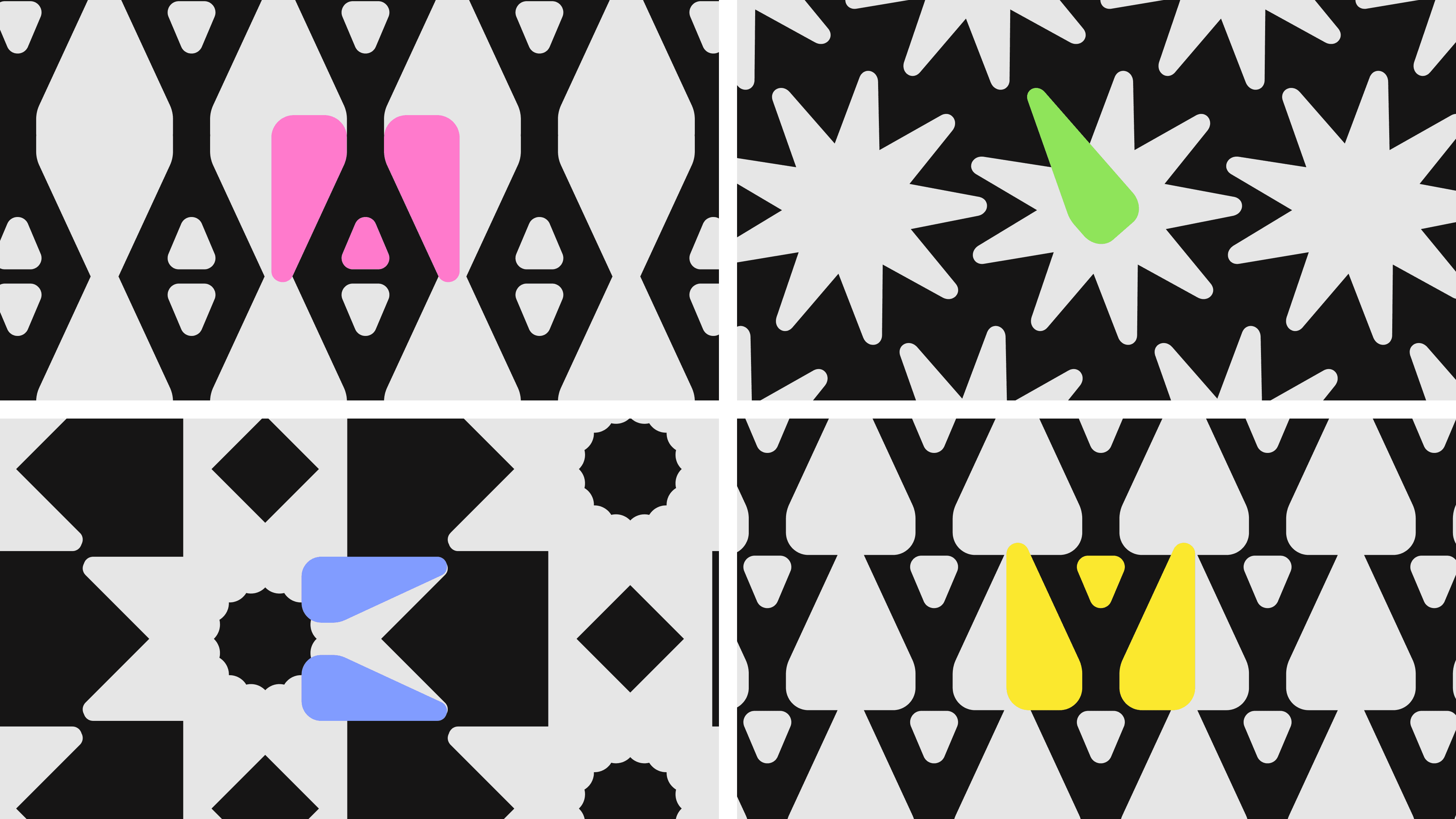
quash is an independent online magazine centered around world affairs and street culture. The site often references music, art, and design with a strong emphasis on curated aesthetics and current trends.

Eryndale Museum of Art is a fictional contemporary art museum with a bold, accessible and playful visual language.

A UX/UI case study developed as part of the Google UX Design Certificate.

YEAR

2025

2024

ROLE

Visual Designer

Brand Designer

UX/UI Designer

Graphic Designer

SERVICES

UX Research

Brand Identity

Mobile App Design

Wireframes

Prototype

THE CONCEPT

RESEARCH

The fluid sound of the brand name and its smooth, rounded letterforms inspired to reinforce these qualities in the logo design.

The UX process started with research planning, interviews, personas and user journeys.

The research highlighted three main needs:
clear planning, accessible navigation and simple ticket purchase.

The app had to work for different visitors: tourists, students, older users and people with accessibility needs, without making the interface feel heavy.

LOGO

The identity started with the museum mark.

The logo was designed as a compact symbol for Eryndale Museum of Art, with the museum’s initials encrypted into its geometric structure. It works across both print and digital touchpoints while staying simple, recognizable and flexible.

LOGO

The identity started with the museum mark.

The logo was designed as a compact symbol for Eryndale Museum of Art, with the museum’s initials encrypted into its geometric structure. It works across both print and digital touchpoints while staying simple, recognizable and flexible.

TYPOGRAPHY

COLOR PALETTE

The Time Burner typeface was chosen for its circular design, which perfectly complements and emphasizes the round letters in the brand name.

The color palette started from Bauhaus references: strong primary colors, contrast and simple graphic blocks.

To make the system feel more contemporary, the palette was pushed into brighter fluorescent tones: acid green, electric blue, hot pink and sharp yellow.

ADAPTATION

TYPOGRAPHY

Top terminals were added to 'q' and 'a' for better readability, echoing the bottom serif and enhancing visual harmony.

The ink bleed effect adds softness and cohesion to the letters, enhancing the smooth, fluid feel of the brand name.

The typography follows the same logic: bold, simple and highly readable.

A clean sans-serif type system keeps the identity functional, while the scale and geometric detalis give it a more playful museum character.

REFINING

PATTERN

Bolder version was chosen for stronger impact and added a subtle outline to improve readability and enhance bold positioning.

The pattern came directly from the logo structure.

By repeating and rotating parts of the mark, the identity gained a more playful and flexible visual language.

SAFE ZONE

VISUAL LANGUAGE

The safe zone is set at 0.5x the size of the ® symbol, ensuring the logo stays clear and impactful by maintaining space from

The visual system combines bold colors, high contrast and simple geometric forms.

It was designed to feel accessible and energetic, while still staying clear enough for wayfinding, tickets and interface elements.

COLORS

FROM IDENTITY TO APP

The logo uses the client’s original brand blue. Additionally, a custom neutral palette was created with White Sand and Dark Shadow – soft white and black tones chosen specifically to give a gentle feel. These colors add versatility across backgrounds.

The app continues the same visual logic.

Patterns became exhibition cards. Tickets became digital passes. Color became a navigation tool.

FROM IDENTITY TO APP

The app continues the same visual logic.

Patterns became exhibition cards. Tickets became digital passes. Color became a navigation tool.

ALTERNATIVE CONCEPTS

CORE FLOW

With the slogan “World Affairs”, and a request for an icon, several logo options were created using different graphic styles while keeping a consistent overall look.

The main flow focuses on planning a visit:
discover an exhibition, choose a ticket, complete checkout and save it for later.

Secondary features support exhibition browsing, guided tours, saved content and in-museum navigation.

MUSEUM EXPERIENCE

The app was designed not only for booking, but also for the visit itself.

Users can explore exhibitions, save events, follow guided tours and use the camera-based museum map to navigate artworks inside the space.

The goal was to keep the experience visual, simple and connected to the identity.

Eryndale Museum of Art became a complete visual and digital system.

The identity defines the mood: bold, geometric and playful.
The app turns that language into a functional museum experience: planning, tickets, saved exhibitions and navigation.

A brand system that starts on paper and continues in the user’s hand.

RESULT

MUSEUM EXPERIENCE

The final logo successfully reflects the smooth, fluid character of the brand while remaining clean, recognizable, and versatile across digital and physical applications.

The app was designed not only for booking, but also for the visit itself.

Users can explore exhibitions, save events, follow guided tours and use the camera-based museum map to navigate artworks inside the space.

The goal was to keep the experience visual, simple and connected to the identity.

Eryndale Museum of Art became a complete visual and digital system.

The identity defines the mood: bold, geometric and playful.
The app turns that language into a functional museum experience: planning, tickets, saved exhibitions and navigation.

A brand system that starts on paper and continues in the user’s hand.

THE BRIEF

The task was to create a logo that is clean, recognizable, and clearly visible, especially when seen on clothing and
user-generated content viewed on
mobile devices.

Museum visits can quickly become stressful: unclear ticket options, limited language support, crowded hours, accessibility needs and too much information before the visit.

The goal was to design a mobile experience that helps different visitors plan their visit with less friction: from choosing an exhibition to buying a ticket and saving it for later.

CORE FLOW

The main flow focuses on planning a visit:
discover an exhibition, choose a ticket, complete checkout and save it for later.

Secondary features support exhibition browsing, guided tours, saved content and in-museum navigation.

Eryndale Museum of Art

OVERVIEW

Eryndale Museum of Art is a fictional contemporary art museum with a bold, accessible and playful visual language.

A UX/UI case study developed as part of the Google UX Design Certificate.

YEAR

2024

ROLE

UX/UI Designer

Brand Designer

Visual Designer

SERVICES

UX Research

Brand Identity

Mobile App Design

Wireframes

Prototype

THE BRIEF

Museum visits can quickly become stressful: unclear ticket options, limited language support, crowded hours, accessibility needs and too much information before the visit.

The goal was to design a mobile experience that helps different visitors plan their visit with less friction: from choosing an exhibition to buying a ticket and saving it for later.

RESEARCH

The UX process started with research planning, interviews, personas and user journeys.

The research highlighted three main needs:
clear planning, accessible navigation and simple ticket purchase.

The app had to work for different visitors: tourists, students, older users and people with accessibility needs, without making the interface feel heavy.

LOGO

The identity started with the museum mark.

The logo was designed as a compact symbol for Eryndale Museum of Art, with the museum’s initials encrypted into its geometric structure. It works across both print and digital touchpoints while staying simple, recognizable and flexible.

COLOR PALETTE

The color palette started from Bauhaus references: strong primary colors, contrast and simple graphic blocks.

To make the system feel more contemporary, the palette was pushed into brighter fluorescent tones: acid green, electric blue, hot pink and sharp yellow.

TYPOGRAPHY

The typography follows the same logic: bold, simple and highly readable.

A clean sans-serif type system keeps the identity functional, while the scale and geometric detalis give it a more playful museum character.

PATTERN

The pattern came directly from the logo structure.

By repeating and rotating parts of the mark, the identity gained a more playful and flexible visual language.

VISUAL LANGUAGE

The visual system combines bold colors, high contrast and simple geometric forms.

It was designed to feel accessible and energetic, while still staying clear enough for wayfinding, tickets and interface elements.

FROM IDENTITY TO APP

The app continues the same visual logic.

Patterns became exhibition cards. Tickets became digital passes. Color became a navigation tool.

CORE FLOW

The main flow focuses on planning a visit:
discover an exhibition, choose a ticket, complete checkout and save it for later.

Secondary features support exhibition browsing, guided tours, saved content and in-museum navigation.

MUSEUM EXPERIENCE

The app was designed not only for booking, but also for the visit itself.

Users can explore exhibitions, save events, follow guided tours and use the camera-based museum map to navigate artworks inside the space.

The goal was to keep the experience visual, simple and connected to the identity.

Eryndale Museum of Art became a complete visual and digital system.

The identity defines the mood: bold, geometric and playful.
The app turns that language into a functional museum experience: planning, tickets, saved exhibitions and navigation.

A brand system that starts on paper and continues in the user’s hand.

Create a free website with Framer, the website builder loved by startups, designers and agencies.