Moth Agency
OVERVIEW
A brand identity for a premium boutique marketing agency specializing in social media, high-performance campaigns, and video content.
OVERVIEW
A brand identity for a premium boutique marketing agency specializing in social media, high-performance campaigns, and video content.

YEAR
2026
ROLE
Brand Designer
DOMAIN
Marketing
SERVICES
Brand Positioning
Logo Design
Color Palette
Brand Guidelines
Typography
Through research, competitor analysis, and client conversations, one goal became clear: build something premium that doesn't perform its own importance.
"The moth moves toward light through darkness: focus, persistence, instinct."
This became the system's core: every element either reflects precision or creates tension against it.
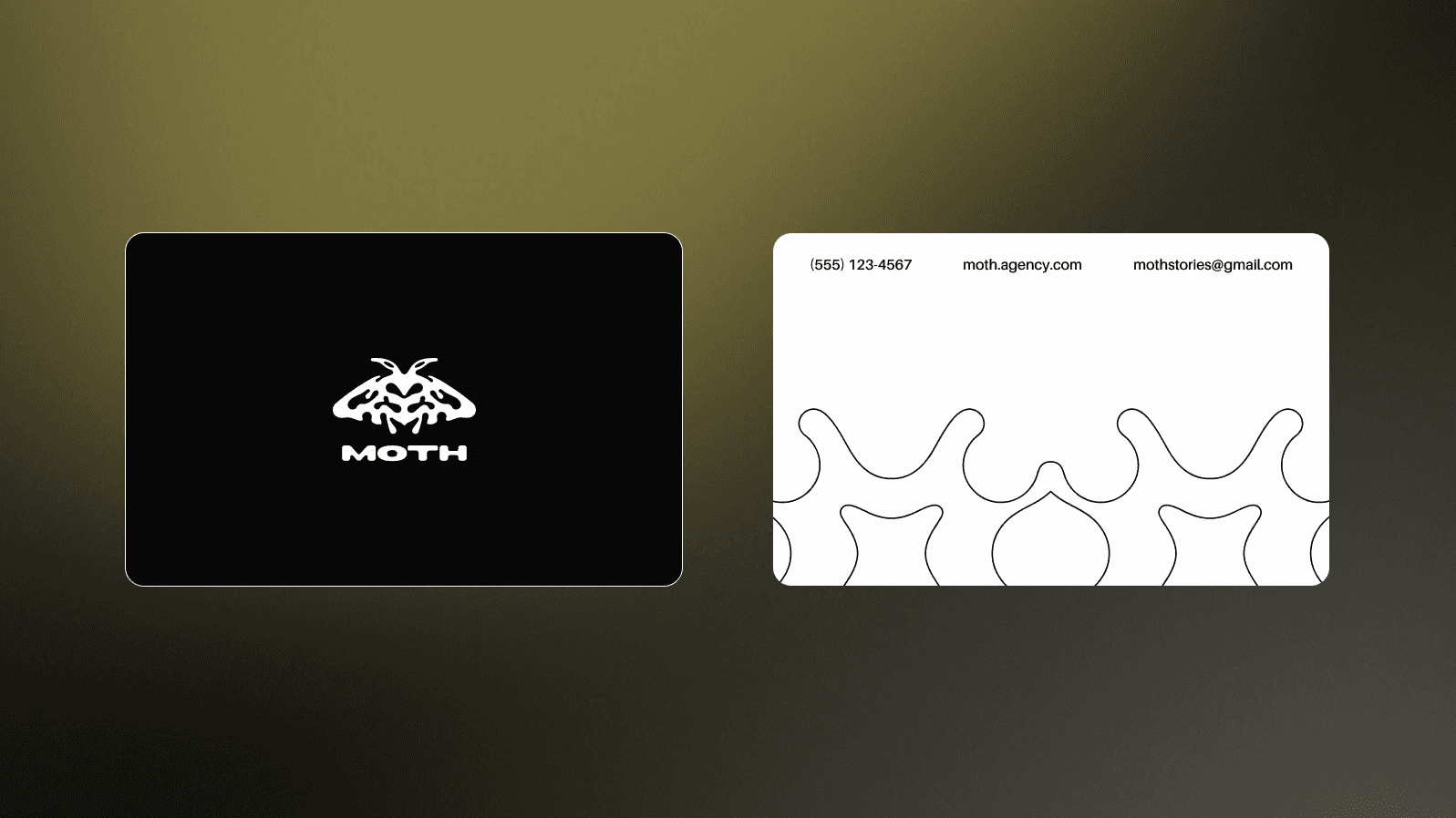
Inspired by Rorschach symmetry: balanced, but never rigid. Built on soft circular geometry to keep a human quality.
Each typeface represents brand's archetype.
[1] Grotesque Moth Grotesk → precision and clarity
[2] Instrument Serif italic → narrative and depth
[3] Script Mynerve → tension and contrast
Every colour was chosen against the obvious option. Near-black instead of pure black: it glows faintly, giving the space a luminous quality.
Glowing white instead of cold or creamy: milky, diffused, felt rather than seen.
Yellow that is sunny and slightly citrus, harmonious rather than aggressive.
Derived from the logotype: the same curves, structured into rhythm.
Unposed, unstaged photography showing real process.
Light is used deliberately: overexposure, harsh flash, intentional underexposure.
Colour and black-and-white. The moth-and-light metaphor runs through every shot, as a consistent visual logic.
Every element was chosen with a reason. The visual system is consistent not because it looks good, but because it's grounded in a single, well-defined concept.
The result is a coherent visual identity built on research, driven by concept, and designed to function across every touchpoint without losing clarity.


