quash
OVERVIEW
quash is an independent online magazine centered around world affairs and street culture. The site often references music, art, and design with a strong emphasis on curated aesthetics and current trends.
OVERVIEW
quash is an independent online magazine centered around world affairs and street culture. The site often references music, art, and design with a strong emphasis on curated aesthetics and current trends.

YEAR
2025
ROLE
Graphic Designer
SERVICES
Logo Design
Color Palette
The fluid sound of the brand name and its smooth, rounded letterforms inspired to reinforce these qualities in the logo design.
The core of the brand is a symbol that unites two G's (Global and Gaming) into a single form. The arrows embedded in the terminals carry the brand's values: movement, interaction, and progress.
The identity is built as a flexible modular system. The symbol serves as a common foundation across all brand directions — differentiation happens through color and direction name, giving each sub-brand its own character while maintaining the unity of the GGH ecosystem.

The Time Burner typeface was chosen for its circular design, which perfectly complements and emphasizes the round letters in the brand name.
The symbol pairs with Space Grotesk — a typeface with a futuristic, technical character where the shape of the letter G echoes the symbol itself. The main brand uses an exclusively black-and-white palette, emphasising its neutrality and role as the unifying core of the entire ecosystem.
The symbol serves as a common foundation for all brand directions, ensuring recognition and integrity of the system.


Top terminals were added to 'q' and 'a' for better readability, echoing the bottom serif and enhancing visual harmony.
The ink bleed effect adds softness and cohesion to the letters, enhancing the smooth, fluid feel of the brand name.
Differentiation of sub-brands occurs through the direction name and color, giving them their own character and values while maintaining the unity of the GGH brand.

Bolder version was chosen for stronger impact and added a subtle outline to improve readability and enhance bold positioning.
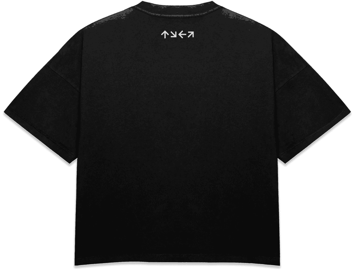
→ T-shirt: main brand in minimalist black-and-white. Front carries the logo at a restrained scale. Back features the arrow graphic element — movement, development, interaction.
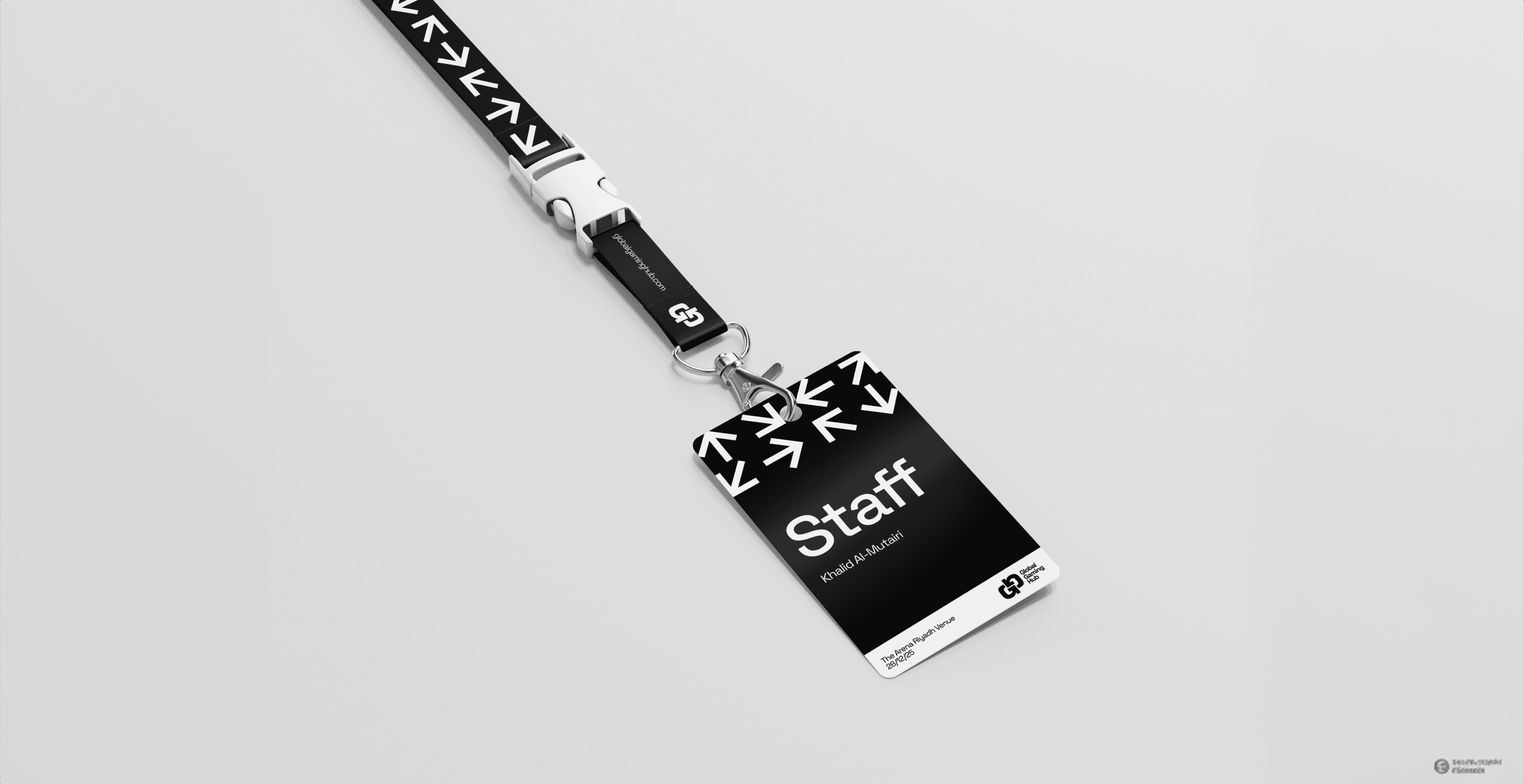
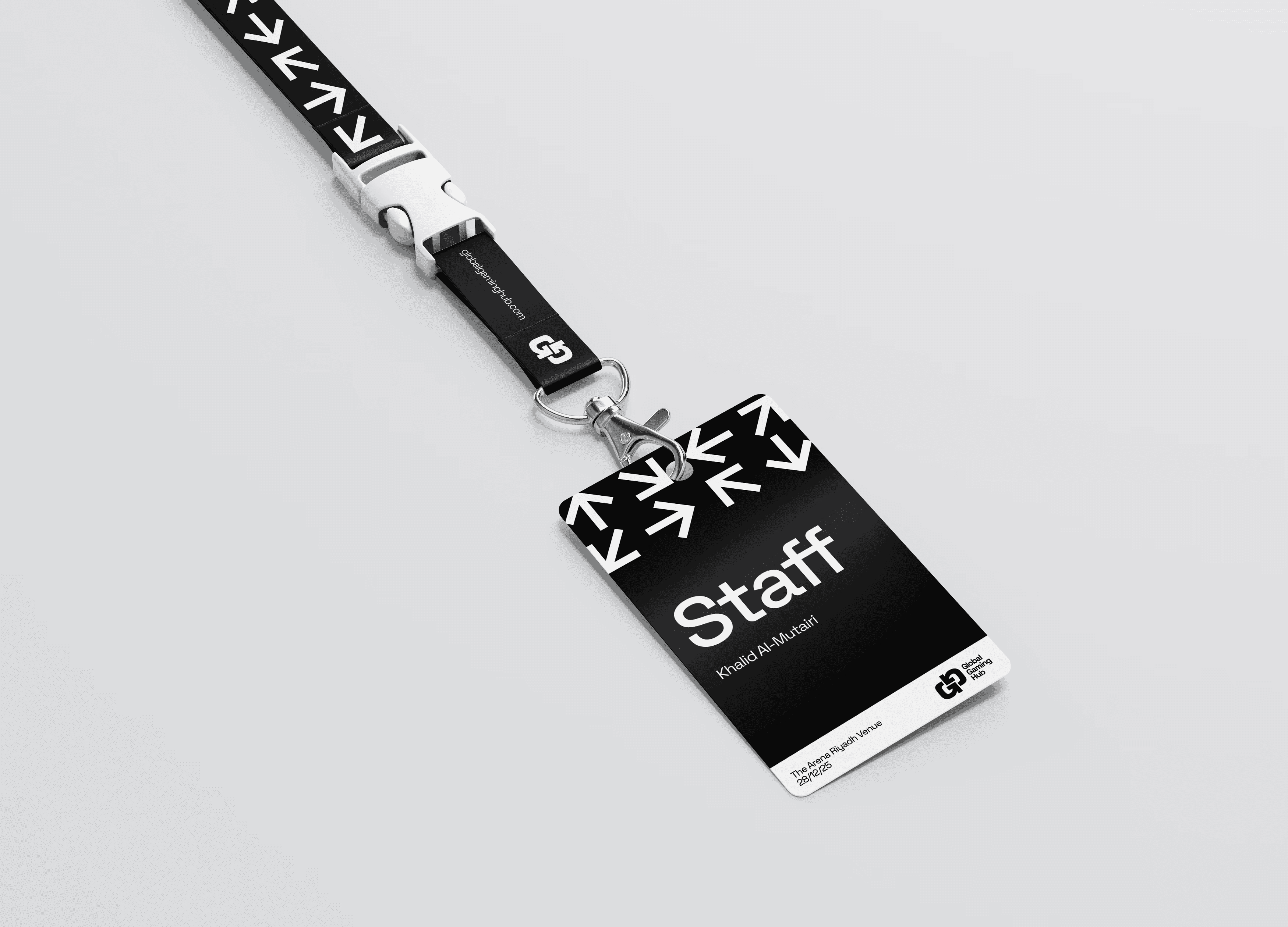
→ Badge: designed as a universal carrier for events, office spaces, and official occasions. Restrained, professional, recognisable.
→ Social media posts: three posts presenting each sub-brand direction — each visually distinct, each traceable back to the same system. Each sub-brand introduces an accent typeface suited to its character: from Bebas Neue for esports tension to Jersey 20 for community warmth


The safe zone is set at 0.5x the size of the ® symbol, ensuring the logo stays clear and impactful by maintaining space from
A modular brand system built to scale across five directions without losing coherence. Each sub-brand has its own visual language and tone but the shared symbol keeps the ecosystem unified. Flexible enough for a startup, structured enough for an institution.
The task was to create a logo that is clean, recognizable, and clearly visible, especially when seen on clothing and
user-generated content viewed on
mobile devices.
An assignment project. The goal was to create a flexible logo and visual identity for Global Gaming Hub — a company building a video game ecosystem across gaming, esports, and technology, with a focus on developing the industry in Saudi Arabia and the MENA region.
The identity needed to cover the main brand and five directions within the ecosystem, a t-shirt, a badge, and three social media posts to present each direction. Completed within 5 days.
OVERVIEW
A company building a video game ecosystem across gaming, esports, and technology, with a focus on developing the industry in Saudi Arabia and the MENA region.
YEAR
2026
ROLE
Brand Designer
Graphic Designer
SERVICES
Logo Design
Visual identity system
Sub-brands development
Social media posts
An assignment project. The goal was to create a flexible logo and visual identity for Global Gaming Hub — a company building a video game ecosystem across gaming, esports, and technology, with a focus on developing the industry in Saudi Arabia and the MENA region.
The identity needed to cover the main brand and five directions within the ecosystem, a t-shirt, a badge, and three social media posts to present each direction. Completed within 5 days.
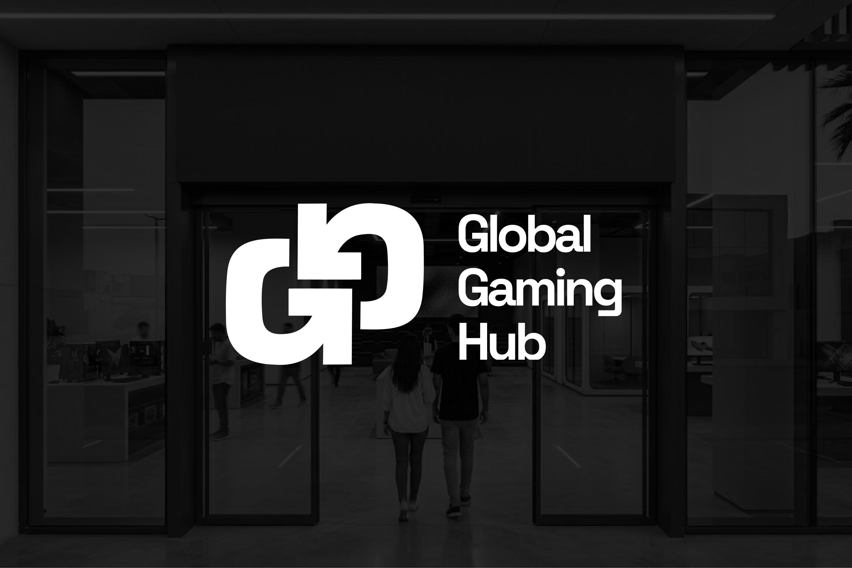
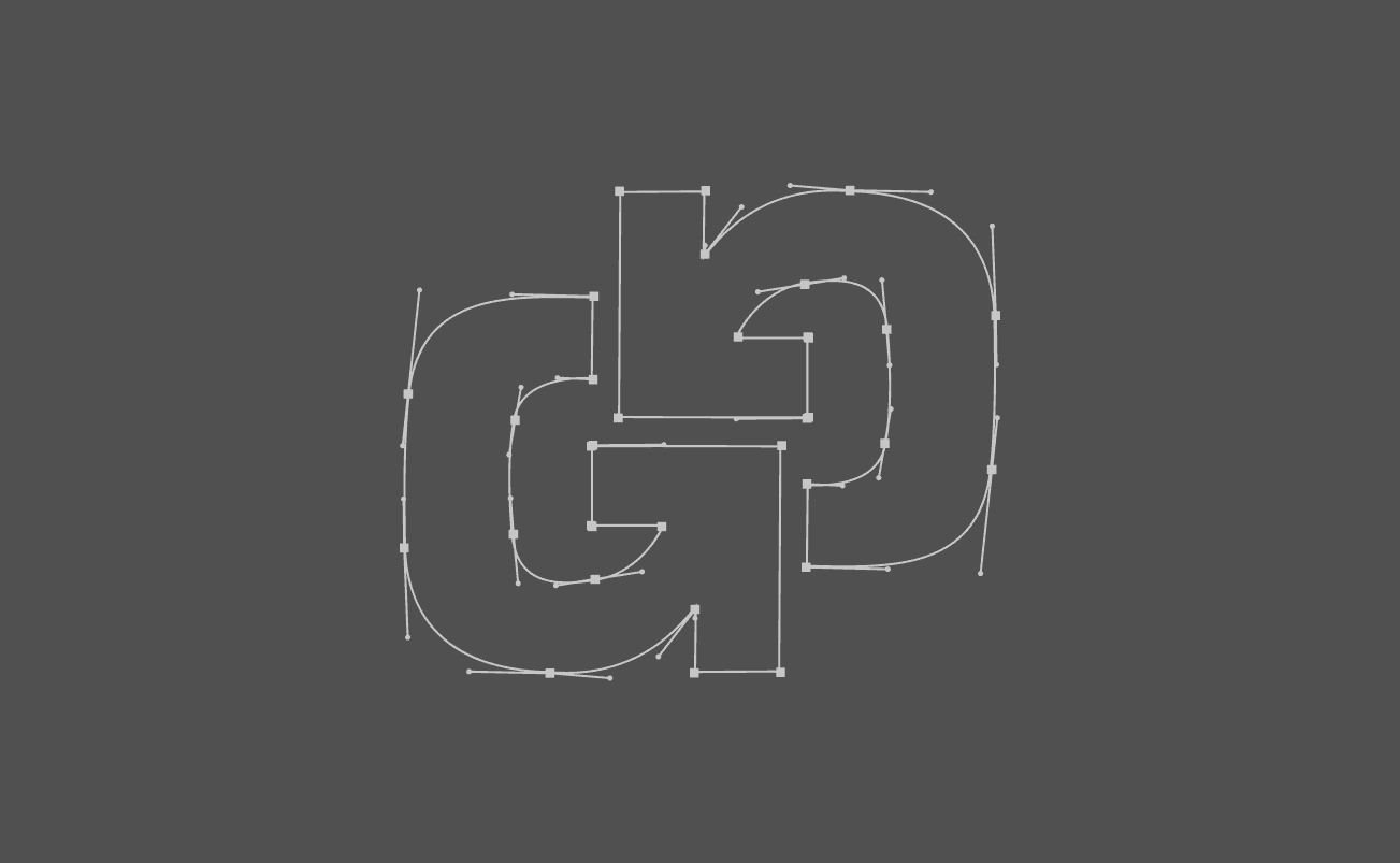
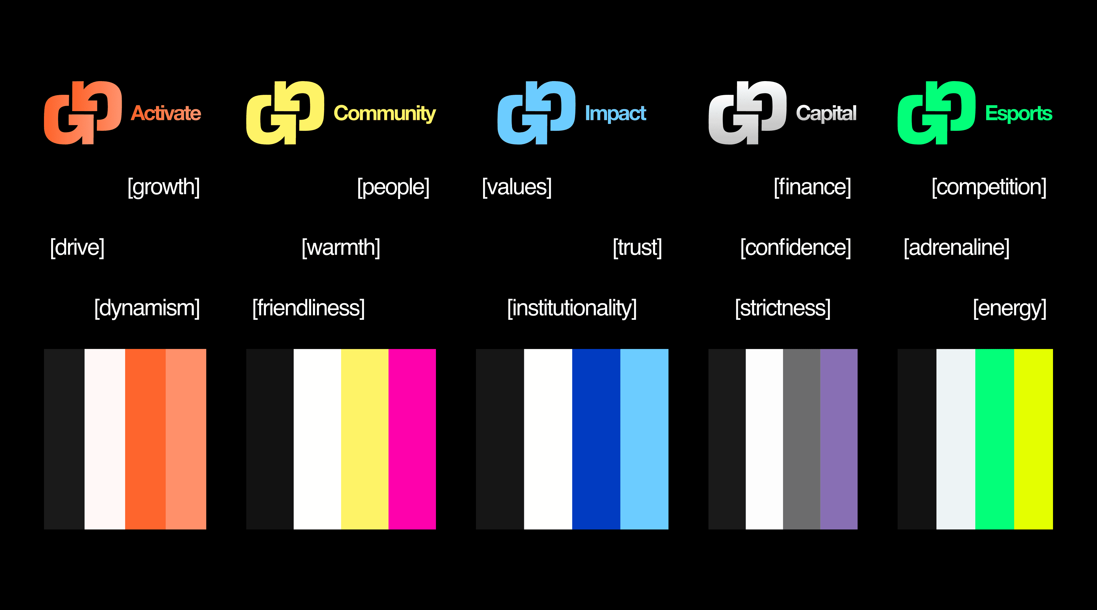
The core of the brand is a symbol that unites two G's (Global and Gaming) into a single form. The arrows embedded in the terminals carry the brand's values: movement, interaction, and progress.
The identity is built as a flexible modular system. The symbol serves as a common foundation across all brand directions — differentiation happens through color and direction name, giving each sub-brand its own character while maintaining the unity of the GGH ecosystem.
The symbol pairs with Space Grotesk — a typeface with a futuristic, technical character where the shape of the letter G echoes the symbol itself. The main brand uses an exclusively black-and-white palette, emphasising its neutrality and role as the unifying core of the entire ecosystem.
The symbol serves as a common foundation for all brand directions, ensuring recognition and integrity of the system.
Differentiation of sub-brands occurs through the direction name and color, giving them their own character and values while maintaining the unity of the GGH brand.
→ T-shirt: main brand in minimalist black-and-white. Front carries the logo at a restrained scale. Back features the arrow graphic element — movement, development, interaction.
→ Badge: designed as a universal carrier for events, office spaces, and official occasions. Restrained, professional, recognisable.
→ Social media posts: three posts presenting each sub-brand direction — each visually distinct, each traceable back to the same system. Each sub-brand introduces an accent typeface suited to its character: from Bebas Neue for esports tension to Jersey 20 for community warmth.

A modular brand system built to scale across five directions without losing coherence. Each sub-brand has its own visual language and tone but the shared symbol keeps the ecosystem unified. Flexible enough for a startup, structured enough for an institution.